Mobile Kanban
On a phone, a full Kanban board is too wide to use comfortably, so Operon switches it to a touch-first layout built for a narrow screen. It is the same board, with the same columns and swimlanes, but the way you move through it is tuned for a thumb instead of a mouse. This page covers what changes on mobile and the settings that shape it.
MEDIA-DOCS-100-1: A Kanban board on a phone.
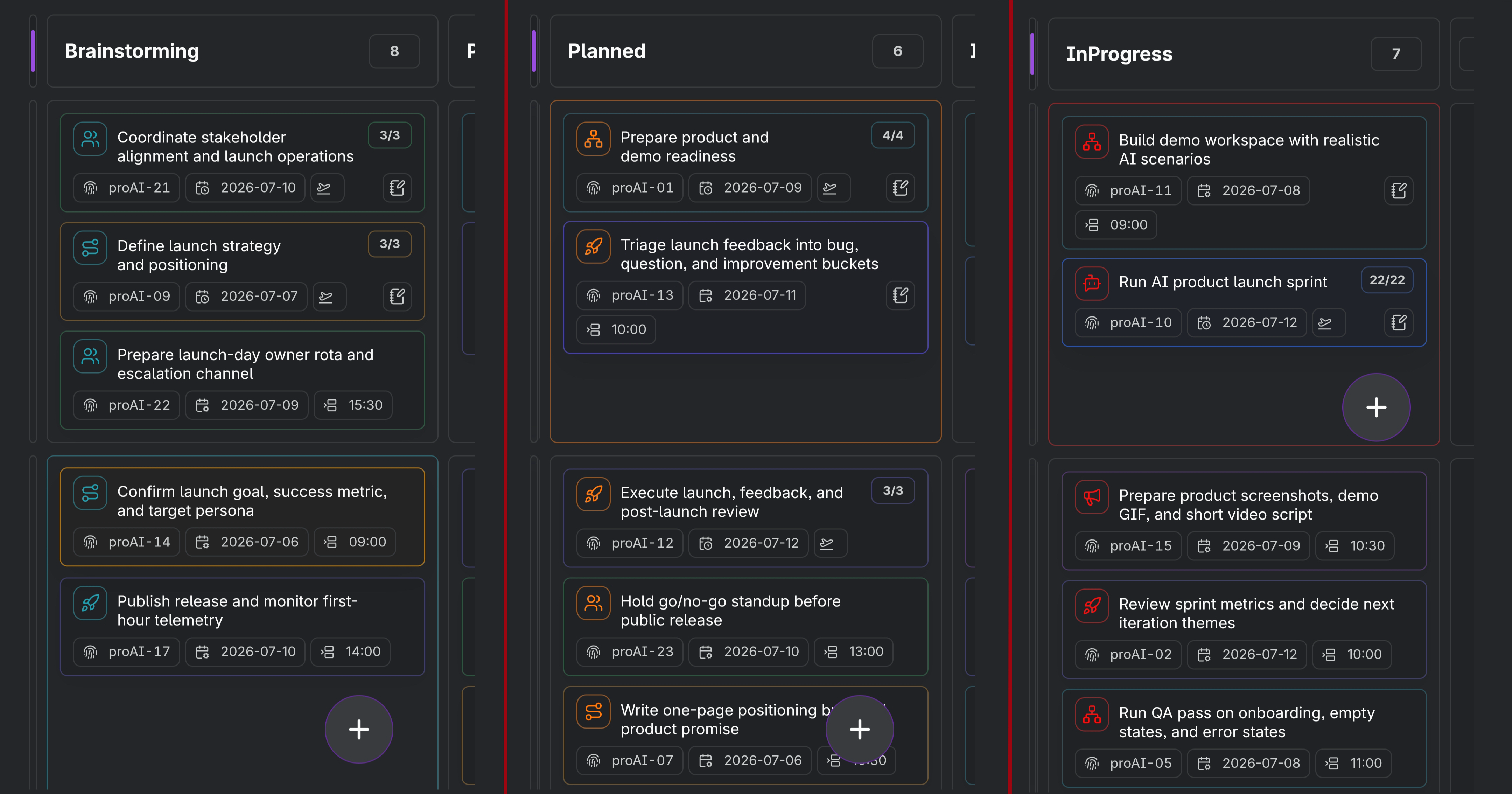
When the mobile layout takes over
Two settings decide this. Enable mobile Kanban layout turns the touch behavior on, and it is on by default. Mobile Kanban layout max width sets the width at or below which a touch Kanban view uses that layout, so the board adapts on a narrow screen and stays in its desktop form on a wide one. The default cutoff is 900 px, adjustable between 600 and 1200.
This is why the same board can look one way on your phone and another on a tablet or desktop: it is the view's width, not the device alone, that flips the layout.
Column navigation with status snap
The horizontal status snap setting is on by default. Despite its name, it follows the preset’s columns whether their property is Status, a date, or another supported field. With it on:
- Horizontal scrolling settles on whole columns rather than stopping mid-column, so you always land on a clean column instead of a sliver of two.
- Dragging a card near the side edges advances it by a whole column, so you can move a card across column values without needing the next column already on screen.
Together these make a narrow board feel like flipping through columns one at a time, which is far easier than free-scrolling a wide board on a small screen. Turn the snap off if you prefer continuous horizontal scrolling.
The compact swimlane rail
When the board is grouped into swimlanes, the mobile layout shows each lane as a thin colored rail down the side rather than a full labeled header, to save width for the cards themselves. Two settings tune it:
- Mobile Kanban swimlane rail width sets how wide that colored rail is, from 6 px (a slim stripe, the default) up to 48 px.
- Always show swimlane rail, on by default, keeps the rail visible at all times. Turn it off and the rail appears only after you scroll horizontally, freeing a little more room until you need the cue.
Preset sizes and cell scrolling
The same preset's Column width and Cell height are used on desktop and mobile. Change them in its Board layout section; the available widths extend to 800 px and heights to 750 px. A wide column can require horizontal scrolling on a phone. See Kanban presets for all sizes and floating controls.
Expanded swimlane cells keep their selected height, with overflowing cards scrolling inside the cell. At its scroll limit, scrolling can continue through the board; empty cells do not block board scrolling. Without swimlanes, the classic board fills the available pane height instead of using the fixed cell height.
Task chips on mobile cards
Mobile Kanban uses the same Kanban Task Chips settings as desktop Kanban, so the chips you choose for cards stay visible on a phone too. On mobile they are read-only: tapping a chip does not open a picker, link, preview, location map, or action. Kanban cards do not show hidden-chip +N counts on mobile.
That keeps card gestures predictable. Tap the card to open it, scroll the board normally, and long-press the card itself when you want to drag. If space is tight, use Icon Only or a shorter Kanban chip order in Settings → Operon → Interface → Task Chips → Kanban Task Chips.
The quick-create button
The mobile quick-create button (the floating plus) appears over Operon's mobile surfaces, including Kanban. If you would rather keep the board clear, you can hide it while a Kanban view is active without turning it off elsewhere. That toggle lives with the other mobile interface settings; see Mobile General.
Settings
Operon settings for this live in Settings → Operon → Mobile → Mobile Kanban. Mobile Layout contains the enable toggle and maximum width. Navigation & Swimlane Rail contains horizontal status snap, Always show swimlane rail, and rail width. Dependent controls are hidden when the mobile layout is disabled; their saved values are retained. Card chip visibility and order live in Settings → Operon → Interface → Task Chips → Kanban Task Chips. The setting to hide the quick-create button in Kanban is on the Mobile General page.
FAQ
My board does not switch to the mobile layout. Check that Enable mobile Kanban layout is on, and that the view's width is at or below the layout max width. A wide view keeps the desktop layout.
Cards jump to the next column when I drag near the edge. Why? That is status snap moving the card by a whole column. Turn off horizontal status snap if you want free dragging instead.
Where are the swimlane labels? On mobile, swimlanes show as a compact colored rail to save space. Widen the rail, or use the board on a wider screen, to bring back the fuller lane presentation.
Can I see the create button on my phone Kanban? Yes, unless you hid it for Kanban. See Mobile General.