Table cells: display and behavior
A table cell is not just a value in a box. It shows a field a particular way, and it acts when you click, hover, or focus it. Two things decide how a cell looks and behaves: the field it holds and the column's display mode. Knowing this pays off when you build a table, because it tells you which columns to leave in full detail and which supported columns to collapse to an icon. This page is the counterpart to Task chips: display and behavior, for cells rather than chips.
For choosing a column's field, order, width, color, and display mode, see Table columns. This page is about the cell itself.
MEDIA-DOCS-112-1: A table row with mixed cells: a chip list, a colored due date, a status tinted by its color, and a source button.

Detailed and compact cells
Icon-bearing task-field columns can use one of two display modes, set from the header menu (Show detailed cell or Show compact cell). On desktop, you can also double-click the column header edge you would drag for resizing to switch a supported column between the two modes. Columns without compact mode stay in detailed mode:
- Detailed cell: the cell shows the full value, as text, a chip, a colored date, or a small control.
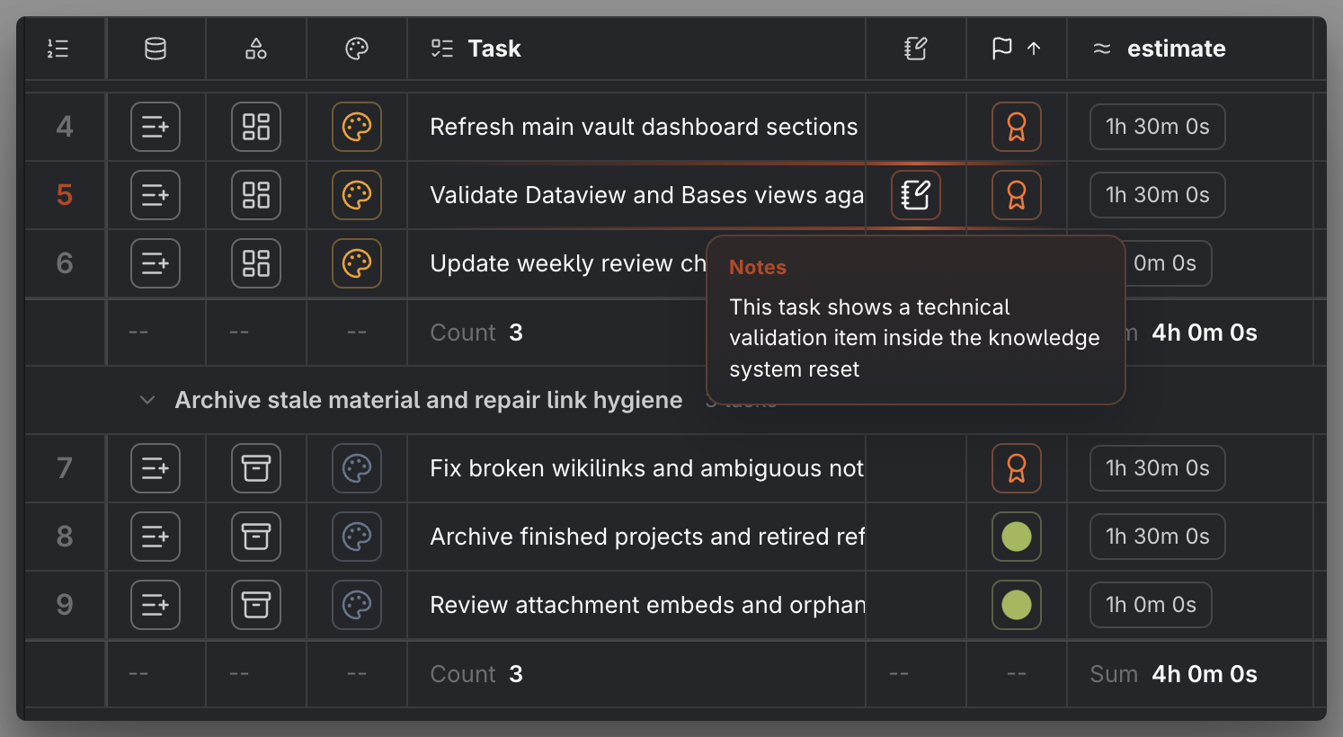
- Compact cell: most supported fields collapse to a single icon; Countdown instead shows one abbreviated time unit without an icon. When there is a value, hovering the compact control shows a tooltip with its details; Countdown identifies the selected date source.
So compact cell mode is how you keep a status, priority, or type column narrow while still reading it on hover. For supported editable columns, compact cells still open their normal editor on click; the icon is a smaller target, not a different action.
Do not confuse this with display density (compact or comfortable), a preset setting that only changes row height. Density is purely visual; detailed and compact cell modes change what a cell shows.
MEDIA-DOCS-112-2: The same column in detailed mode and in compact mode, with the compact cell's hover tooltip revealing the full value.
What a cell shows, by field
In detailed cell mode, each field type renders its own way:
| Field | The cell shows |
|---|---|
| Text, number | The value as plain text |
| Status, priority | The value, tinted by the column's color mode |
| Due, Scheduled | The date in your chosen Date format, turning red when overdue and blue when due today |
| Other task dates | The date in your chosen Date format, in neutral text |
| List, tags | One chip per item in the field |
| Task Type | The user-managed classification, editable as Text |
| Task Image | One media-reference value or chip |
| Task Gallery | One ordered chip per media reference |
| Task links (parent, blocking, blocked by) | A wikilink chip per linked task |
| Links (web links) | A chip per link: a named Markdown link shows its label, a bare URL a tidied address |
| Assignees, contexts | A chip per linked person, place, or context value |
| Location | A small map chip |
| Duration | Tracked sessions as chips, or a rolled-up total, depending on the column's mode |
| Parent task progress | A progress indicator over the task's subtasks or checkboxes |
| Description | The task's text, with any wikilinks live |
| Source | A button that opens the task's source |
| Project Serial | A chip with the task's serial, where a scope covers it |
| Countdown | A bordered, read-only remaining-time value with an hourglass icon; details below |
| Task Tree | A hierarchy control and, in detailed mode, the occurrence number |
| Line number, task icon helper, Task Data Type helper | The row number, a status icon, or an inline-or-file icon |
In detailed cells, an empty field usually shows a plain --, with exceptions for calculated values that have no applicable result. Countdown is empty when no valid target exists. Project Serial also has an empty state: a task outside any Project serial scope renders a fully empty cell instead of --. Empty compact cells can render blank when there is no value to turn into an icon. Once a task is finished or cancelled, its Due and Scheduled cells drop the red and blue, because the deadline no longer presses, the same rule as task chips.
Built-in and custom task fields typed as Date follow Settings → Operon → General → Date format. Date Time Start, Date Time End, and custom task fields typed as Date & time combine that date choice with the existing 12- or 24-hour Time format, while keeping the cell's existing time precision. In compact cell mode, a date-and-time cell still shows only the time (14:30); its tooltip and accessible label carry the complete formatted date and time. These presentation choices do not change the canonical value used by the picker, sorting, grouping, or export. Arbitrary file task property columns keep their stored date text in this version.
Task Tree cells show an occurrence, not a writable property. A task with children gets a circled chevron that expands or collapses that exact visible occurrence. A projected descendant uses a branch marker; a top-level task with no children uses a dot. Detailed mode adds hierarchy numbers such as 1, 1.2, and 1.2.1, while compact mode keeps the structural icon only. The column can use Table color modes, but clicking its control never edits parentTask. See Table columns.
Assignees show an icon beside each name in detailed cells. When a linked person's image is available, it replaces that person's icon. A compact cell with one assignee can show that image; with several assignees, it keeps the shared assignees icon and lists the names in the hover tooltip. Missing or unreadable images keep the usual icon. This also applies to embedded Tables. See How to show assignee images for setup.
The Links column turns web links into readable chips. In detailed cell mode, each entry has a Links icon. A named Markdown link, [Design doc](https://example.com/design), shows its label (Design doc), and a bare URL shows a tidied address. Long labels end with an ellipsis; hover the chip to see the full URL.
On desktop, click a link chip to open its page in an Operon lightbox. Hold Cmd on macOS or Ctrl on Windows/Linux to open a new Obsidian Web Viewer tab instead. Enter or Space on a focused chip opens the lightbox. Both paths need Obsidian's core Web Viewer plugin enabled; if it is unavailable, Operon shows a short notice. Close the lightbox with ×; see Task chips for the viewer's behavior.
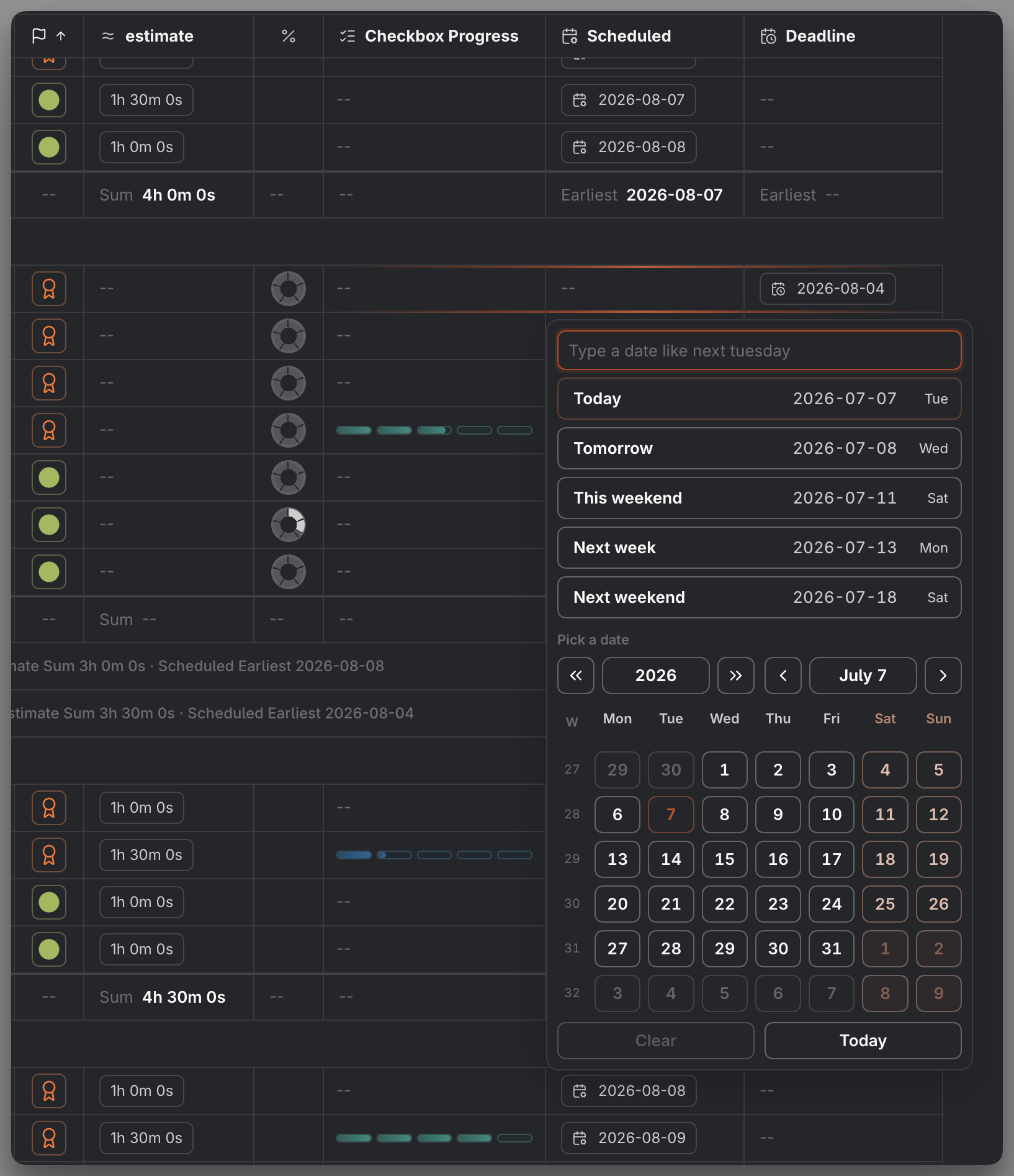
Click the cell's empty space to open its picker when the cell is editable. Opening a link chip does not also open the picker. Compact cells keep their existing editing behavior, and mobile behavior is unchanged. These rules also apply to embedded Tables.
Countdown cells
Countdown has a border in both modes. Compact shows only the largest nonzero unit, without an icon: 1y, 234d, 23h, or 55m. For a timed target below one minute it shows <1m; at or after the target it shows 0m.
Detailed places an hourglass icon on the left and the value on the right, such as 1y 234d 23h 55m. Leading zero units are omitted; smaller units remain, so 2h 0m keeps minute precision. Seconds never appear in the cell itself. Dates without a time use calendar years and days only, such as 1y 12d, 1d, or 0d. Years are full calendar years with remaining days; months are not used.
The border is centered by default. Changing column alignment moves the border; detailed text remains right-aligned inside it with fixed-width numerals. Compact borders share a width close to the cell edges. Detailed borders use the widest current value among the filtered rows, including rows outside the visible viewport, while staying within the available column width. If a narrow column clips the value, the tooltip provides the full text.
Hover or focus a populated Countdown chip to open one Operon tooltip. Its heading is Scheduled, Due, or Scheduled / Due, followed by the full target in your date/time format and the detailed countdown. For timed targets, seconds update while the tooltip is open, for example 2h 12m 8s; after expiry it shows 0s. All-day targets remain at day precision. Closing the tooltip stops its seconds display, so the table itself does not become a wall of ticking seconds.
Countdown uses the column’s normal color, border, and hover/focus styling. With no valid target, there is no border, icon, or placeholder. Clicking or double-clicking the cell does not edit the task or start a timer. See Table columns for target selection and color rules.
What a cell does on click
Cells fall into a few roles. Some edit a value in place, some take you somewhere, and some open a control:
| Role | Where | Clicking it |
|---|---|---|
| Edit in place | status, priority, dates, estimate, recurrence, list, tags, parent/dependency links, and other editable picker fields | Opens that field's picker |
| Edit text | description and note cells | Opens the text editor path; wikilinks inside a description remain live |
| Navigate from text | wikilinks inside description text | Opens the linked note, creating it if it does not exist yet |
| Open a web link | a chip in the detailed Links column on desktop | Click opens a lightbox; Cmd/Ctrl-click opens a new Web Viewer tab |
| Open a place | location cell or chip | Opens the map popover, which pins open when you drag it. See Location picker |
| Act on structure | parent task progress | Opens the task's subtasks or checkboxes |
| Expand hierarchy context | Task Tree column | Expands or collapses the selected visible occurrence without changing the task or base Table result |
| Go to source | source column | Opens the task's source in a new Obsidian tab: the note for a file task, the exact line for an inline task |
| Cycle and menu | task icon column | Follows the global task icon click preference; its hover menu is the contextual menu |
| Open the editor | Task Data Type helper | Opens the Task Editor; Cmd/Ctrl-click opens the source instead |
General row and cell behavior:
- Double-click a row to open the full Task Editor, except controls that handle the gesture themselves, including read-only Countdown cells.
- Read-only cells, such as the source and file columns and automatic fields like operonId, display their value and do not open a picker. The source cell is the exception: it is read-only as a value but still opens the source.
From the keyboard, focus an editable picker cell and press Enter or Space to start editing, the same as clicking it. Description and note text cells also support F2 for their text-editing path.
MEDIA-DOCS-112-3: An editable date cell clicked open, showing the date picker anchored to the cell.
Editing text in compact cells
A text field behaves a little differently when it is collapsed to a compact icon. When a description or a note column is in compact cell mode, clicking its cell does not open a field picker; it opens a text editor popover, a small floating panel for editing that field's text in place. The panel carries the field's name and the task's description as a heading, and it saves what you type when you dismiss it, by clicking away, pressing Escape, or using its close button.
The two text fields have deliberately different policies. A description is the task's single-line title. A note can contain several visual lines: use Shift+Enter to add a line break, or paste multiline text including blank lines. For an inline task, Operon serializes those note breaks as \n inside the note field, so editing never splits the physical Markdown task line. The same popover behavior is available in an embedded table and on the Kanban. See Text field editor popover for the control itself.
MEDIA-DOCS-112-4: The text editor popover open over a compact description cell, with its multi-line editor.

Hover: tooltips and previews
Hovering a cell can reveal more without a click:
- Compact cells show a tooltip with the field’s details, so a collapsed column stays readable. Countdown uses its date source as the heading and adds live seconds for a timed target.
- Wikilinks inside text cells and wikilink-style task link chips support Page Preview: hold Cmd or Ctrl and hover to get Obsidian's hover preview of the linked note. This needs Obsidian's core Page Preview plugin enabled, and the modifier key; a plain hover does not trigger it.
- Web link chips in the Links column show their full URL on hover, with a hint for opening the lightbox or a new Web Viewer tab.
- Task Image and Task Gallery chips share the same compact preview for supported local or web images, videos, PDFs, and YouTube links. Named Markdown links show their assigned label. Click the full-width preview header to open the media lightbox; images also keep double-click opening and zoom and pan controls. See Task images and galleries.
How this guides configuration
Because a cell both shows and acts, the display mode you pick per column has consequences:
- Collapse status, priority, and type to compact cell mode. They read at a glance, and the hover tooltip and click behavior stay intact.
- Keep description, dates, and any link or list fields in detailed cell mode, where the full text and chips are worth the width.
- Remember that compact cell mode keeps the supported column's normal action. A compact editable cell still opens its editor; a compact date still carries its overdue or due-today color on the icon when it has a value.
Tips
Collapse what you recognize, expand what you read
If you know a field by its icon, such as status or priority, set it to compact cell mode and reclaim the width. Keep the columns you actually read as words, like the description and dates, in detailed cell mode. The row gets shorter while supported compact cells keep their tooltip and click behavior.
FAQ
Does a compact cell lose information? No, when the field has a value. Hover it for the full details. Editable fields keep their editor in compact mode; read-only Countdown remains non-editable in both modes. If the value is empty, the compact cell can be blank.
Why is a due date red or blue? Red means overdue, blue means due today. A finished or cancelled task drops the color.
What is the difference between detailed cells, compact cells, and density? Detailed and compact cell modes decide what a cell shows. Density (compact or comfortable) only changes row height. See Table presets.
Why does clicking a cell not do the same thing everywhere? Cells have roles. An editable field opens a picker, description wikilinks open notes, the source column opens the source, location opens the map popover, and read-only cells only display.
Why does Task Tree show the same task in two places? One is the task's normal filtered row; the other is a contextual occurrence under an expanded parent. The contextual occurrence does not add to counts, summaries, grouping, or export; existing sort rules can still order siblings inside that branch.
How do I get a hover preview of a linked task? Hold Cmd or Ctrl and hover the wikilink chip, with Obsidian's core Page Preview plugin enabled.
Why won't a web link in my Links column open? On desktop, enable Obsidian's core Web Viewer plugin. In a detailed cell, click the link chip for a lightbox or Cmd/Ctrl-click for a new tab. The cell's empty space opens the picker when editing is allowed; compact cells keep their normal editing behavior.